De
I use Mapline to input flags so I can visually see the area, then copy and paste those addresses into circuit to optimize my day of driving.
ONE app would be amazing instead of Mapline, Circuit, Google Maps.
As
In the middle of a 25 stop route yesterday, I accidentally tapped the big Optimize button. This immediately caused the application to "re-optimize" my route which completely changed the order of my stops and made the route MUCH less efficient. Some type of confirmation before re-optimizing is needed. On top of that, every time I press the "show on map" button, the application closes.
Si
I struggle to see if i have a drop off or pick up, you have to skip locations in between then unskip them. After completing your stop it doesn't go away. You have to scroll down until you find your next location everytime. If you skip it, it turns yellow just like the completed items.
Findings from Customer Review Analysis
(From competitor’s apps)
KEY INSIGHTS
Customer reviews from Play store and App store for circuit, Route4me, Zeo and Routific.

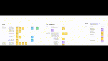
Understanding User flows from the User Interviews
Affinity Mapping
Discover : Understanding the problem space
In this step :
from the market were studied and analysed
4
Apps
of the competitor's apps were studied to identify existing gaps.
100+
Reviews
with the delivery drivers to define user journeys, generating task & user flows.
3
Interviews
with the existing app screen for improvisation
2
User tests
DISCOVER
DEFINE
DEVELOPE
DELIVER
Designing the right thing
The project's initial focus was on revamping the UI for existing screens. Prior to delving into high-fidelity designs, I tried to understand the user needs and align them with the business goals.


3 major user flows based on different scenarios
Successful delivery on the first attempt.
Postponed delivery due to a time window.
Postponed delivery due to the customer being unavailable on delivery.
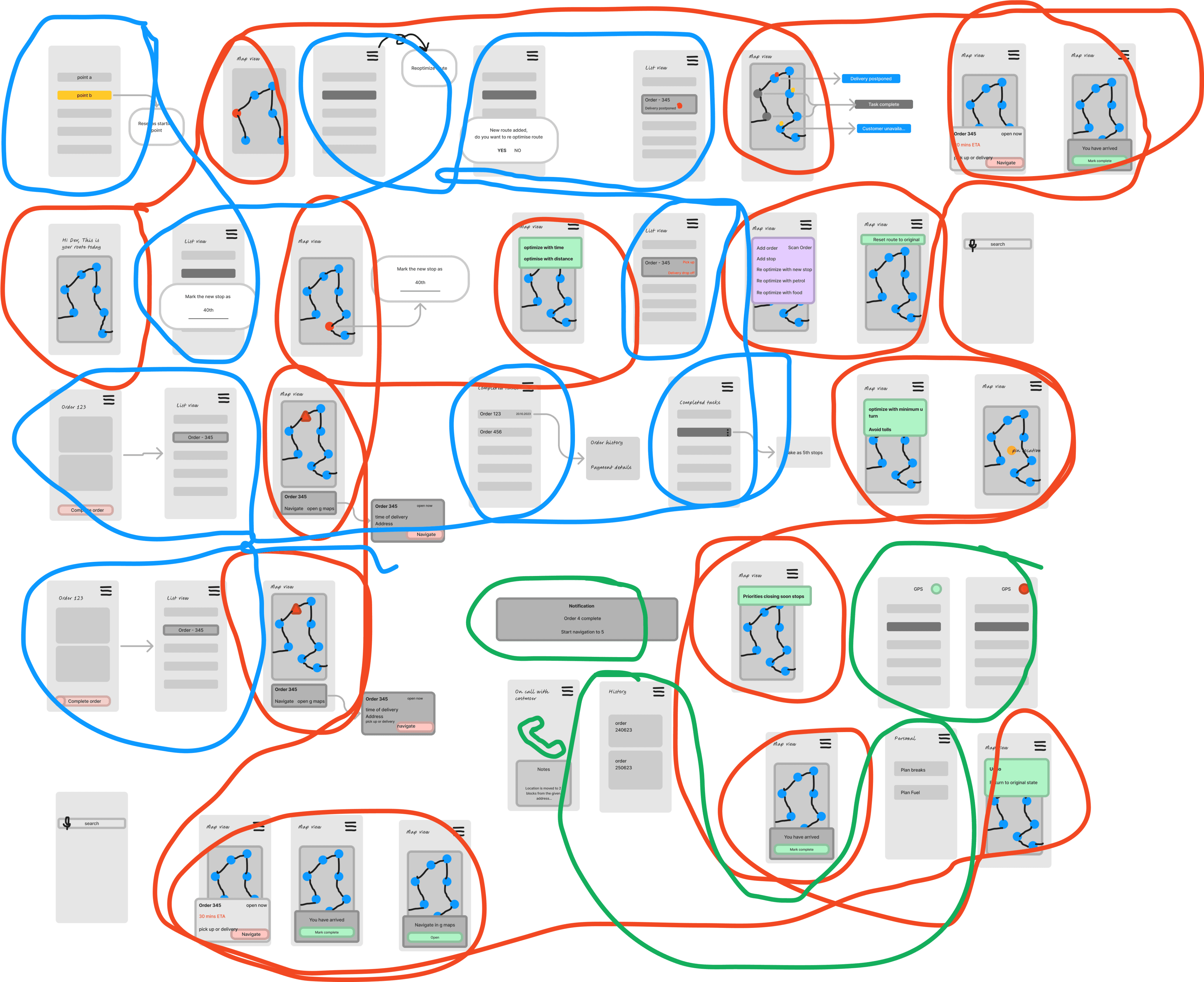
Upon comprehending the work flow of the drivers, I identified and grouped user actions and system actions that shared similarities across different flows. This consolidation resulted in the creation of unified screens that streamlines user flow across different task flows.
By centralizing activities with shared characteristics, I established a framework that ensures consistency across different scenario.
1. Users need to switch between multiple
apps to accomplish their jobs.
The fragmented nature of these applications prevents effective communication and coordination with customers and managers disrupting their workflows
2. Delivery drivers often tend not to read extensive texts.
Accessing critical information becomes challenging due to unclear UI elements and lengthy textual content, adding to the user's cognitive load. Poor representation of data reduces the driver's ability to comprehend their schedule/route before starting a job.
3. Quick edits, modifications and route optimization are not easy to perform,
Which is crucial for drivers in response to unforeseen circumstances on road. The absence of error mitigation induces panic among users and leads to significant time wastage.
Define : The design challenge
& the Problem Statement
DISCOVER
DEFINE
DEVELOPE
DELIVER
Designing the right thing
Upon identifying user pain points and comprehending their workflow, I filtered and elaborated on the key issues to define the design challenge and problem statement
In this step I conducted,
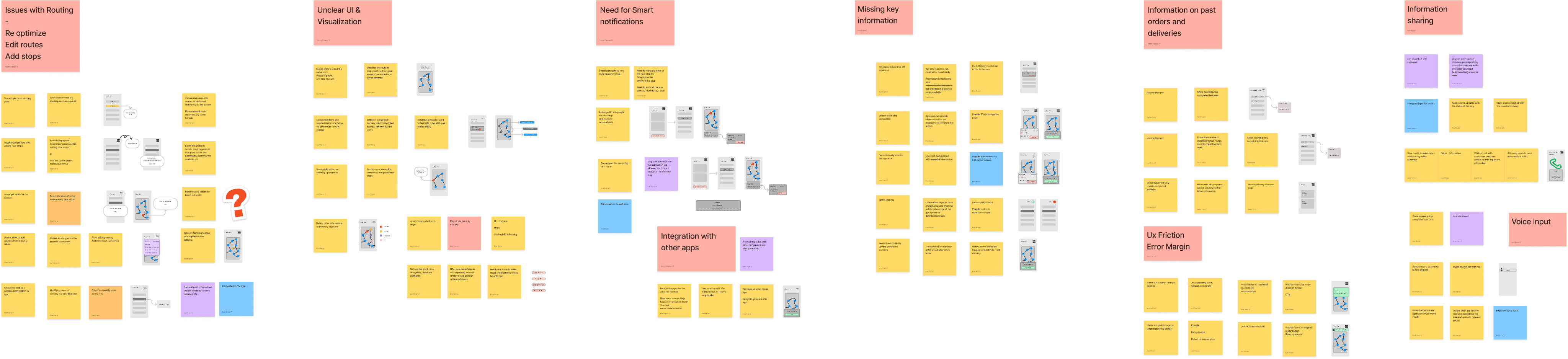
Affinity mapping & Moscow analysis, narrowing down essential points to develop solutions further.
Identified key themes, grouped pain points, and brainstormed low-fi wireframe sketches for each. This highlighted efficient solutions for diverse user problems that can be addressed on a single screen, aiding in categorizing and organizing information to meet user needs.
--> Issues with Routing & Optimization
--> Unclear UI & Copy
--> Missing Key Information
--> Integration with other apps
--> Error Margins & UX friction
--> Communication & Collaboration
Route Assist
Supporting the last mile delivery drivers
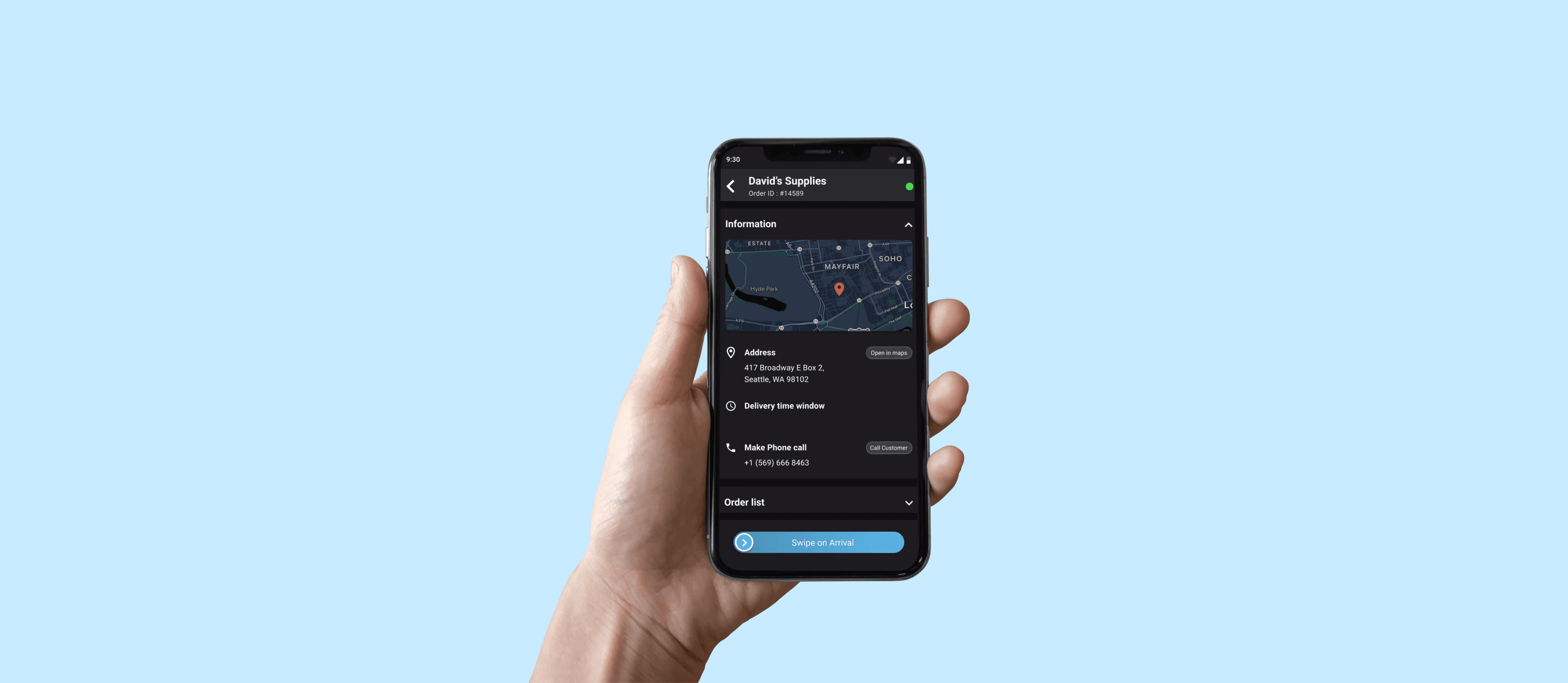
Product Feature | UX | App feature
DISCOVER
DEFINE
DEVELOPE
DELIVER
Designing the right thing
Before jumping into the solution mode, I wanted to connect the consumer problems with the business goals
In this step I,
Conducted screen analysis for existing app screens
Sketched & developed wireframes for the above mentioned app features
61% of delivery businesses believe that the last mile is the most inefficient part of their supply chain, which amplifies the pressure on drivers, significantly impacting their work life.
Route Assist empowers drivers to pre-plan routes and accommodates real-time modification, enhancing delivery efficiency for drivers and businesses.
Client : Delivery Dynamics
Solo Project : 4 Weeks
Methodology : User Research, Competitor Analysis, Rapid Prototyping
Tools : Figma, Adobe Suite, MS Office
Background
Delivery Dynamics provides businesses with a centralized platform for efficient monitoring, management, and optimization of last-mile delivery operations. As part of their comprehensive solution, Route Assist is an intuitive mobile app designed to streamline the last-mile delivery experience for drivers and merchandisers
Role & Context
I independently redesigned the driver experience by identifying and analyzing user pain points to effectively address the usability challenges
Develope : Wireframing and User Testing
Flow 2
More to follow.
Here's my alternate
digital corners :)
Moscow Analysis as Design strategy
Using MoSCoW analysis, I prioritized four key elements ( as product features ) for immediate impact on user experience and business, with future steps focused on enhancing the overall experience.
FUNCTIONABLE
Aarron Walter’s Hierarchy of user needs
RELIABLE
USABLE
DELIGHTFUL
3
Clear and consistent UI and Copy
Enhance visual clarity by employing colors to distinguish between different types of orders. Improves information comprehension by reducing cognitive load
2
Streamlined Navigation with Intuitive CTAs
Organize action items in alignment with user workflows, minimizing app switching.
Employ user-recognized clear copy for CTAs, derived from card sorting feedback
1
Visual Route Optimization : Improves decision-making and Simplifying on-the-go adjustments
Allows drivers to understand the routes before accepting the job order and improves user experience by allowing modifications based on on-road condition.